 |
| Something Swanky |
At first I thought, oh another picture tutorial... but then I clicked over to the source. Ashton at Something Swanky has put together the best tutorial on making your own header and navbars!
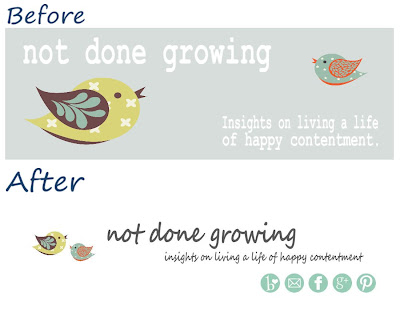
Her walk though is easy to follow and great! I was not even planning to do a re-design, but just reading her post inspired me to try. I put all of this together in about an hour using My Memories Suite as my photo editor.
I have always seen these great headers and wondered how they did it. Seriously, maybe it's just the newbie coming out, but I have been wanting to do something like this since I pretty much started Not Done Growing.
I'm loving the new design. It is simple and clean. I like that my social media buttons are now front and center too.
Which brings me to another great tip from Something Swanky: the use of Image Map to embed links in your pictures! Check off another one of those blog things that I have wanted to figure out. I found the Image Map site to be pretty easy to figure out, but if you need help, Ashton has a tutorial for that too!
I really cannot say enough great things about Something Swanky, and encourage you all to check it out sometimes!
So, what do you think about the new look?
Looking to grow your blog? I have Sponsor Spots open this week - priced to fit any budget, including FREE! Hop over to my sponsor page for more details.


Loving the new look Holly! :)
ReplyDeleteKatie~
Dysfunction Junction
Great job. Pretty and fresh. Thanks for joining us this week at Transformed Tuesday.
ReplyDeleteHugs,
Peggy~PJH Designs
Very cute! Thanks for linking up with Inspired Tuesday.
ReplyDelete